.avif)
Since we came out of stealth in 2020, Cresta has been on a mission to help the world’s leading organizations transform their customer conversations into a competitive advantage. Today, we’re unveiling a new chapter in that journey: an entirely new visual identity that captures the energy of what we’ve built, where we’re headed, and the profound transformation happening across the contact center industry.
Over the past year, we’ve introduced powerful innovations, from the launch of AI Agents to the deep analytical capabilities of AI Analyst. We also raised $125M in our Series D, reinforcing the belief our customers and investors share in our vision. As enterprises increasingly bring agentic AI to the forefront — like Cresta customers Alaska Airlines, Cox Communications, and others — we’re evolving our company to meet this moment.
What’s New?
The name Cresta is inspired by the crest of a wave: the moment where momentum and transformation meet. Like that wave, our end-to-end platform harnesses the energy of repetitive work and redirects it toward higher-value pursuits. By unlocking human productivity, Cresta creates abundance, freeing teams to focus on what drives growth, deepens customer relationships, and opens space for entirely new possibilities. In this evolution, we were inspired by the wave and anchored on three key words – transformative, adaptive, flow – that translated to some of the core tenets of our new brand identity.
Just like waves that reshape entire continents, our AI is reshaping the customer experience, unlocking profound efficiency and effective gains through our platform for human and AI Agents. Our new brand identity captures the energy, flow, and motion of transformation in every interaction we touch.
Logo
Our new logo reflects our forward-looking approach: streamlined, modern, and rooted in motion. The interpretation of the wave for our new logo was inspired by the mathematical concepts illustrated by Lissajous curves, whose intricate patterns reflect the interplay between signals.

These patterns, formed by the interaction of two harmonic oscillations, mirror the essence of conversation itself: the relationship between two parties, rich with rhythm, variation, and insight. Just as Lissajous figures are used to visualize audio waveforms and analyze dynamic systems, they metaphorically—and mathematically—capture the complexity and beauty of human dialogue.
That inspiration carried through every design decision, from the flowing, rounded peak of the “A” to the carefully considered angles and spacing in the “C,” resulting in a mark that balances precision with fluidity. For the first time, the Cresta logo now incorporates motion, a visual representation of energy, flow, and ongoing evolution.
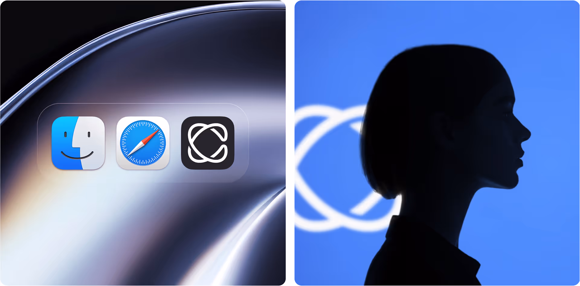
For the first time, we’ve introduced a standalone logo symbol, an evolution that speaks to our growth as a company. While it still hints at the “C” from our name, it now stands on its own, representing a more confident, ownable identity. The overlapping lines convey flow, adaptability, and layered intelligence – true hallmarks of how our technology and partnerships work in harmony.
Typography
We’ve introduced a refined and versatile typographic system that elevates our voice: clear, confident, and unmistakably Cresta.
Our new primary typeface, DM Sans, was selected after exploring numerous variations for its ability to perform across a wide range of applications. It’s bold and legible in all-caps from a distance, yet flexible enough for body copy and nuanced use. We’ve also incorporated a “Mono” variant to bring an edgy, analytical edge – all within the same font family.
Every choice was made with intention, ensuring our typography is as effective in digital environments as it is in print.
Color Palette
We’ve evolved our color palette to bridge where we’ve been with where we’re going. The previous Cresta brand leaned heavily on ocean-inspired shades of blue.
While we’ve retained some of those familiar tones as a nod to our origins, we’ve expanded the palette with a more modern, energetic range of colors. These new hues bring depth, contrast, and vibrancy to our brand, supporting a tech-forward identity while offering highlight colors we’ll use thoughtfully across digital and print environments. It’s a palette designed not just for aesthetics, but for adaptability and longevity.
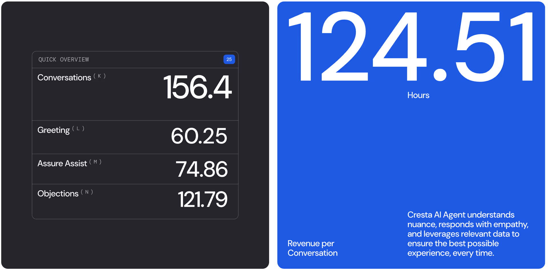
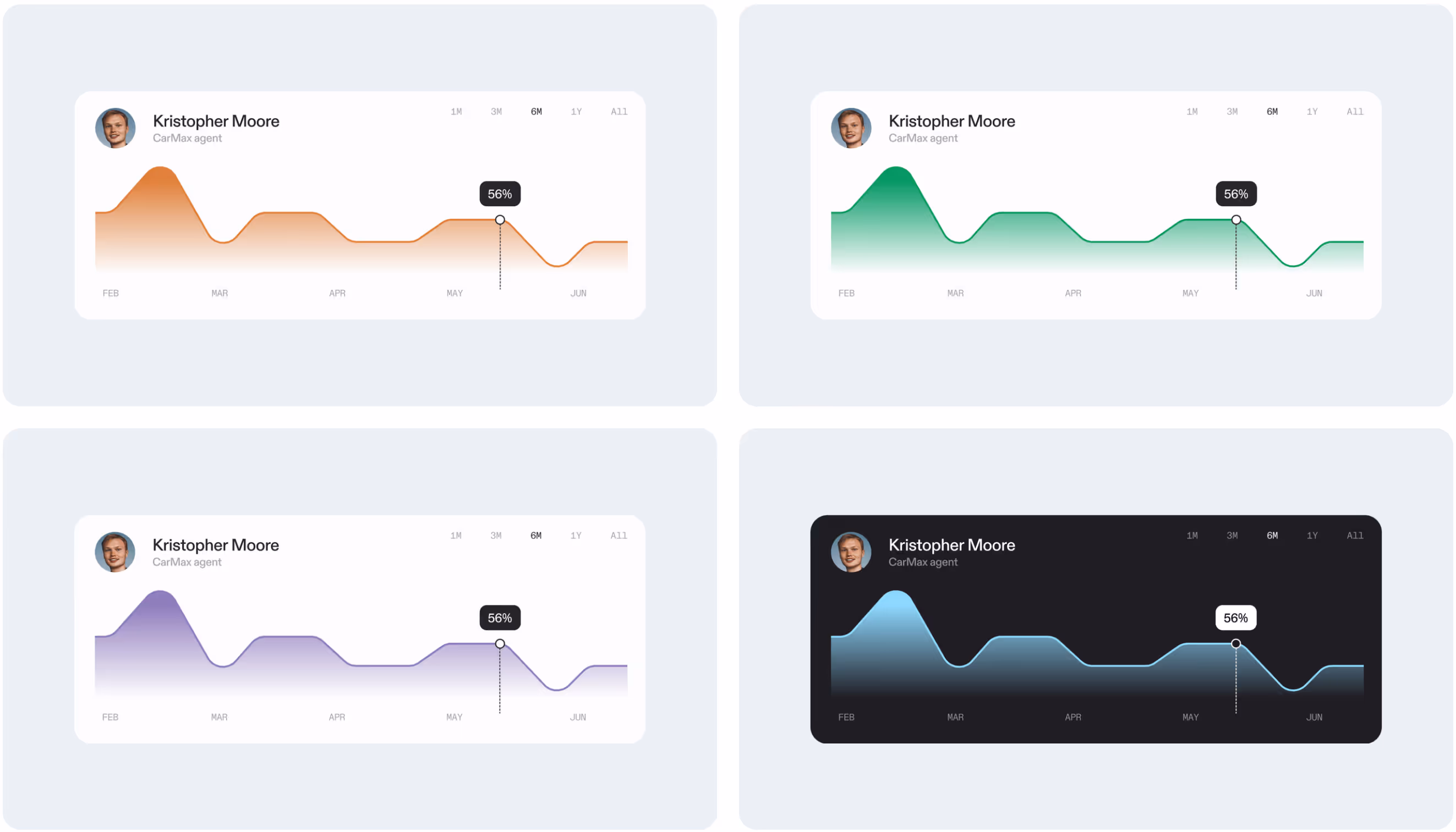
Photography & Illustration
As part of our brand refresh, we’ve taken a strategic and intentional approach to photography and illustration, treating them not just as decorative elements, but rather as integral components of our identity system. Paired with our typography and color system, these visuals help convey depth, energy, and flow, core themes in our identity.
We’ve taken a deliberate approach to light, using it to shape subjects, highlight texture, and create dimension.

We’re also leveraging generative AI to create expressive visuals, like the new homepage background, which captures a sense of transformation and depth. Even our avatars and portraits reflect this evolution, as an ai-native organization, it’s imperative that we use AI day-to-day.
Why We’re Evolving
The world of enterprise AI is changing fast. Adoption is accelerating, expectations are rising, and AI itself has rapidly advanced from simple augmentation to full agentic capabilities. We’ve evolved our technology in step with those shifts, supporting customers as they make the move from assistive to autonomous systems – and our brand needed to evolve too.
Our refreshed brand is centered around the theme of transformation, designed to match the scale of our vision and the power of our end-to-end platform.
Enabling Better Outcomes, Everywhere
Ultimately, this refresh helps us deliver on our mission with greater clarity. We’re proud to be trusted by the world’s leading enterprises to make the promise of AI real, practical, and transformative.
We’re proud of what this brand represents: not just the company we’ve been, but the company we’re building. Thank you to our fabulous partner Motto who worked with us on our visual identity from soup to nuts, Zabal Media who built our website on an all new platform, and thank you to our team, our customers, and our partners for being part of this journey.
To experience our brand more deeply, check out the all new Cresta website here.
We can’t wait to show you what’s next.