Imagine you’re a customer experience (CX) executive sitting in your weekly standup. An analyst pulls up a chart breaking down recent conversations by customer satisfaction (CSAT) and one trend immediately jumps off the screen: CSAT scores have dropped.
Naturally, you ask: Why?
Your team would need to spend the next week digging through just a fraction of all transcripts, pulling additional reports, and stitching together a story before they can bring you an answer.
But why should it take a week? Why shouldn’t you be able to click the chart to ask your question directly?
Traditional business intelligence (BI) tools were never designed for the day-to-day realities of understanding the customer experience. Leading BI tools excel at producing clean quantitative charts, but when it comes to uncovering the “why” and “so what,” they leave teams stranded.
Where Traditional BI Stops Short and Why That Matters
There are a few key gaps in traditional BI tools when it comes to understanding and acting on unstructured customer experience data:
- They stop at the surface: Any BI tool will allow you to summarize a metric like average CSAT or handle time. You can filter, sort, and slice the data however you want, but ultimately, you’re left with polished visualizations that require manual analysis to uncover root causes. Leaders or executives that want to understand “why scores dipped last week” often have to wait weeks or even months for an answer.
- They aggregate data without interpreting it: Traditional BI tools are designed to only show highly structured data like sales or conversation volume figures, not the signals from complex, unstructured conversational data that make up contact centers and other voice of the customer data points. As a result, the rich context of customer experience rarely makes it into dashboards.
- They weren’t built for continuous refinement: Traditional BI tools supply the building blocks to show a known relationship between multiple variables, but they are not able to connect the dots between underlying thematic narratives in transcripts and quantitative trends shown by data.
They don’t support the exploratory digging and iterative process of trying to narrow in on an answer, such as, “which specific customer segment has been most affected by the new subscription policy and why?”
Every chart represents thousands of customer conversations, so when negative sentiment spikes, it represents more than just a number. Hidden behind that number are signals of broken processes, frustrated customers, or policy confusion that can’t wait a week to diagnose.
How Cresta Has Changed the Model
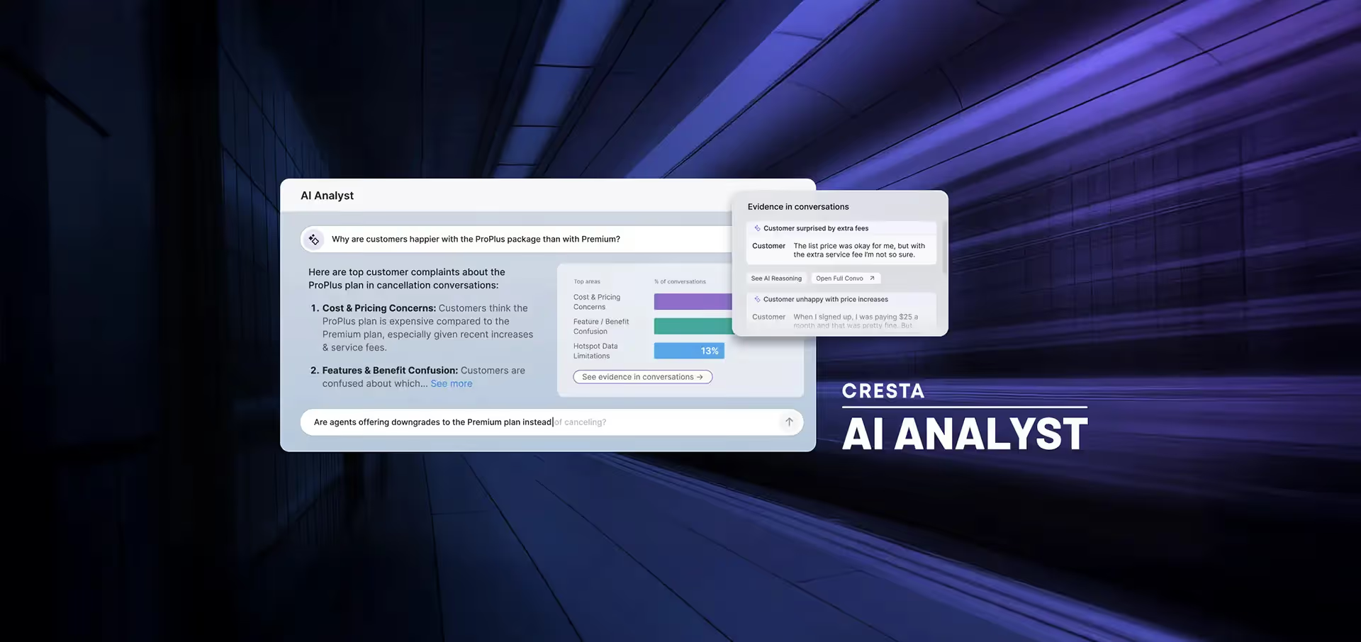
This is where Cresta’s approach leapfrogs traditional BI tools. Cresta’s Dashboard Builder is a self-service, customizable chart creation tool that helps answer critical business questions, track customer trends, and uncover competitive shifts. With AI Analyst embedded directly into Dashboard Builder, you can go from a static chart to the full picture in seconds.
- By clicking on any segment of the chart, you can immediately view conversations relevant to that selection, ask AI Analyst a question about that set of conversations, and have a detailed deep research report in seconds
- Anyone, whether you’re an analyst, manager, or executive, can click into a chart and instantly ask nuanced questions about the data to see beyond the basic visualization to the underlying reasons driving the trends shown
- There’s no need to export the data elsewhere or try to context engineer a large language model to analyze the conversations yourself. It’s all done right in the Cresta Insights suite
Real-Life Examples in Action
A financial technology company with a suite of accounting products was able to quickly understand how their agents were pitching different features to customers and better refine their coaching tips.
An airline company was able to figure out the specific frustrations and pain points for customers that were calling about the Venezuelan airspace closure of 2026 and monitor their call center’s ability to address those concerns.
From Reporting to Action
What sets Cresta apart is the ability to easily move from seeing a trend to understanding its cause and acting on it.
- Track key metrics across customer experience and agent performance in Dashboard Builder
- Drill into any chart segment and ask AI Analyst to diagnose issues and surface trend drivers hidden in conversations
- Use insights to action products (e.g., Agent Assist, AI Agent, etc.) to turn those patterns into prescriptive actions that improve processes, agent coaching, and customer outcomes
See how Cresta helps contact centers turn dashboards into decisions by scheduling a demo today.

.avif)


